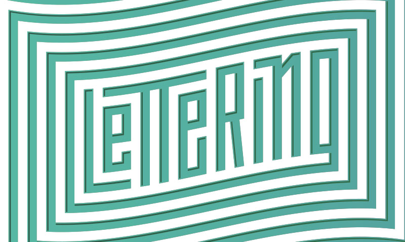
Hello! In this week’s newsletter, I want to show you how to use a grid to create a custom modular sans-serif type lockup. This is a fun and pretty simple technique. We will start with pencil and paper, and end by refining our piece in Adobe Illustrator. In Illustrator, we can tighten up our sketch on a digital grid system, and warp it to add some visual interest!
1. Initial sketch - Define basic letter relationships
Loosely sketch your word to find interesting ways that the letters can interact with one another. Don't worry about refining your sketch too much in this phase. Again, the point of the initial sketch is to find interesting ways that the letters can interact. If you look at my sketches, you will notice I wasn't concerned with perfect letter spacing. To start, write out your word and start experimenting with potential arrangements. Some letter combinations might work better than others for this style, so if you are struggling with your word, try a different one. Tip: You can incorporate a mixture of lower and uppercase letters. It's fun to tuck letters into open spaces, and to extend ascenders and descenders. Just experiment a bit and have fun with it!
2. Refine Sketch - Break out the grid paper, and set constraints.
I know that setting constraints for a project might seem limiting at first glance, but you will be surprised with how creative you become once you have set some rules for yourself. This is the step where we begin to pay closer attention to the details. A tip to help you get started working on the grid is to set some constraints regarding the size and spacing you will use to create your letters. During the process of creating your letters on the grid, you might realize that your constraints need to be adjusted in order to be able to construct one of your letters. That's ok, it's just part of the process. Adjust your constraints and then move forward! For my example, I decided to assign equal spacing between each letter, and to use that same measurement for the width of the counter shapes within each letter.
One way to increase the legibility of your lettering is to create consistency throughout the letterforms.
For instance, in my example, I have aligned the bottom of the bowl of the letter "e" with the bottom of the bowl of the letter "R".
Now, refer back to you initial sketch, and start drawing on the grid. I start by sketching the outlines of my letters and make adjustments as I move from letter to letter. Draw on the lines of your grid paper. This will help you draw straight lines, and help you maintain equal space between your letters. At this point, your lines don't need to be drawn with a ruler, but try to draw them as straight as you can. Just eyeball it for now.
3. Refine Digitally
First thing I do in illustrator when working in this style is, I go up to the View menu at the top of the screen and select "Snap to Grid". Having this checked will ensure that our lines snap perfectly into place on the grid. This is a convenient setting for working in this style where we want perfect spacing.
To create my letters digitally, I use a combination of the pen tool (P) and the rectangle tool (M). Using these tools, we can refer back to our refined pencil sketch and translate it to our digital grid. It's not necessary to scan or photograph the sketch, since it was drawn on a grid system. So, just by looking at our sketch, we can easily understand how many units tall each letter should be and so on.
If you check out the animated GIF above, notice that I am able to shift around the points to easily change the height of the letters while retaining equal spacing. We can thank the Snap to Grid setting for this.
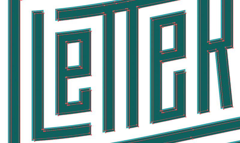
One struggle you might encounter while making your letters is how to deal with diagonal lines. For subtle shifts in the angle of a rectangle, it is acceptable to use the Free Transform tool (E) in Illustrator. Like I said, this works fine for subtle changes, but when you need to transform your shape to a sharper angle, I recommend you turn off Snap to Grid and use the rotate tool (R) to position the shape into place. Tip: After clicking R for the rotate tool, hold option and click to set a point from which your rotation will pivot. If you skew a rectangle too harshly with free transform, the shape will become obviously thinner. The tricky part is, after rotating the rectangle to the desired angle, you might see that it overlaps the boundary of your letterform. In this case, you will need to zoom in to add and remove vector points to retain the integrity of your refined sketch. An example of this is when I created the diagonal line for the letter "n". Tip: Hit the keyboard shortcut Command + Y on your mac to view your design in Outline Mode. This will show you the bare bones of your paths, and allow you to align your shapes more accurately.
4. Add Style with the Warp Effect
Once your are happy with your digital lettering, you can use the Warp Effect to make your lettering even more dynamic. Before using the Warp Effect, you will need to select and group (Command + G) your lettering. If you don't group your letters together, the Warp Effect will be applied to each letter individually, as opposed to warping the overall composition of your lettering. Once you have grouped and selected your lettering with the arrow tool (V), navigate to the top drop down menus of illustrator and scroll over the Effect column. From here you can scroll over the word warp, and you will have an array of different styles to choose from. For now, select arc. This will prompt a box that will allow you to preview all of the different styles before you choose. The advantage of using Warp Effects, as opposed to skewing your lettering, is that Warp Effects are non-destructive. If you open your Appearance panel, you can shut off the Warp Effect, and your lettering will be back to its original state.
5. Add Depth by creating an inline shadow or highlight
Once you have chosen your favorite warp effect, you can add depth to your piece by adding an inline shadow or highlight. To do this, we will use the Offset Path function, and the Pathfinder Tool. Both of these tools are game changers! So, if you don't know about these, this will be a great tip!
Above is a snapshot of the Offset Path function. By setting the offset to a negative number, the path that creates your lettering will shrink by what ever number you choose. Ultimately, You will end up with thinner letters within your original letters.
Next, lets change the color of the newly offset path to a darker color so we can see it in contrast to the original.
We will know need to duplicate our newly offset path, and use Pathfinder to create the inline. Select the new path, and copy (Command + C) and paste the copy directly in front with Paste in Place (Command + F). Now, hold shift, and drag the copy down and to the right a little bit. The further you drag down and to the right, the larger your inline will be. You can also use the arrow keys. Once you have done this, open the Pathfinder panel by scrolling up to the top menu and select Window > Pathfinder.
Now, select both copies of the offset path, and hold Option while hitting the Minus Front button on pathfinder.
After all those steps, you should end up with something looking like this!


