
Hello! I have had a few people ask me about brush script lettering, so in this weeks newsletter, I want to share with you some tips and techniques for creating custom brush script lettering. I have split this newsletter into three sections: Understanding the Brush Script Style, Drawing Brush Script, and Digitizing in Adobe Illustrator using vector with the pen tool.
1. Understanding the Brush Script Style
Before attempting to draw this style, I think it is important to first familiarize yourself with its key attributes. Below are three ideas to help you start thinking about the construction of brush script letters.
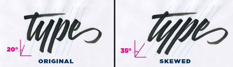
Another aspect of the brush script style is the angle at which the tool is held while writing the letters. This is something that will really help when it comes to drawing the letters with pencil. Notice that the angle of the tool is held consistently throughout each stroke. In this way, the angle at the top of the stroke should match that of the bottom of the stroke.
You do not need to write each letter in a continuous manner. You can draw the first stroke, pause, adjust the pressure on the pen, and then precede to draw the second stroke. When writing and drawing brush script, remember that down strokes are heavy because more pressure is used with the pen, and upstrokes are light because less pressure is used.
2. Drawing Brush Lettering
To find a reference to practice from, you can find a few examples by searching “Brush Script Font” in google images. For your convenience, I have pulled the following example. (This font is available for purchase from www.FontBros.com)
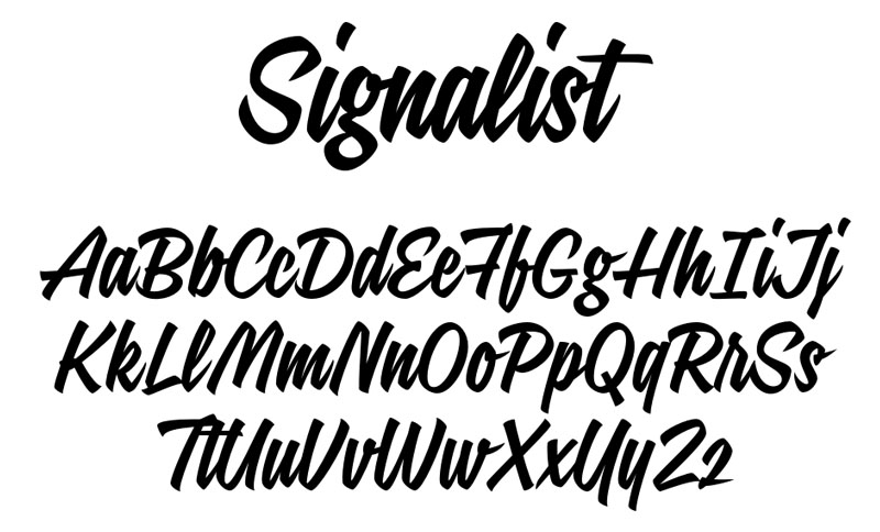
I’ve got a thing for bold scripts, so for this demonstration I want to focus in on recreating one letter and redrawing it to be even more bold than it already is. I like the capital “R” of this alphabet, so paying attention to the watch-outs we just went through, let’s recreate the letter “R”.

l start by drawing a bounding box for my artwork, and then precede to loosely define the letter. At this stage, I define the angle at the top and bottom of each stroke to be about 45°, and look at the reference with a critical eye and ask questions about the relationships between each stroke of the letter. Notice that the leg of the "R" does not share the same angle as the rest of the strokes. This is because the angle of the brush is adjusted in order to achieve the correct thickness of the diagonal stroke.
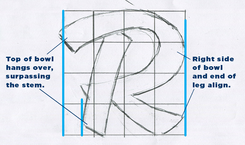
I noticed that in the reference, the top of the bowl extended far to the left; sticking out further than the vertical stem. So, I started drawing that relationship, and then noticed that the right side of the bowl and the leg aligned on the right side.
TIP: Draw on top of your grid with sheets of tracing paper so you will have a fresh grid to work with on your next iteration.

Next, I took a clean sheet of tracing paper, and drew over my loose sketch, adding weight to each stroke to make it more bold.

Next, I filled in the outlines to get a better understanding of the visual weight the letter has taken on. Then, with another clean sheet of tracing paper, I drew the final outline.
3. Digitizing in Adobe Illustrator - Vector with the Pen Tool
I start by scanning in the lettering. Since we will be working with vector on top of the image, the scan does not need to be overly high resolution.

In Adobe Illustrator, I place my image into the document, label its layer “sketch”, and then set that layer to be a template. As a template layer, its contained image will be dimmed to whatever percentage of opacity you choose. Another feature of template layers is that your image will render even when you are in Outline Mode (Command + Y). Outline mode is a display setting that will show you the bare bones of your paths. In this mode, the strokes and fills of your paths will be hidden. This mode is useful for studying the shape of your path. I then lock the sketch layer and create a new layer for my digital paths.
Before getting into placing points onto the art, let’s look at a couple examples.

To make circular shapes, points are plotted on the top, bottom, left, and right of the shape, and the handles for each point are evenly distributed. In the example on the right: a similar curve can be achieved by extending the handles of the point on the top and bottom, but at the end of the day, the shape turns out looking off balance.

Often times, your letters will not be perfect circles, and in this case, you would distribute the handles a little differently. The points will still be plotted on the top, bottom, left and right, (also referred to as the Extrema), but the handles will have to be adjusted in accordance to the change in width. As the length of an arc increases, you will need to pull the handles of the corresponding anchor points further. Notice that the left and right handles can stay the same, while the top and bottom handles get longer to compensate for the change in length. Just to reiterate, although the handles are uneven, this is different than the example I showed for the uneven distribution of handles on the circle. In this case, the left and right points still have handles that contribute to the arc.
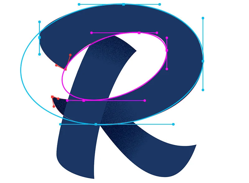
When placing points on an irregular shape, your points should also be positioned on the extrema of each arc. One way to think about the construction of the bowl of the letter "R", is that you are basically creating two shapes; an inside and an outside. You will need to place your points on the extrema of both the outside and inside shape.

In the demonstration above, You will see that I like to make adjustments to the path on the fly. In this example, I laid down a point at the far left of the leg, and then moved down to the lowest extrema to plot the next point. At the same time as I clicked to add that bottom point, I held down Shift and dragged to the right until the path between the two points curved to line up with my sketch. I then overshot the pointed corner, adjusted the curve with the direct selection arrow (A), doubled back, and then clicked and dragged to create the final curve path of the leg. I picked up this tip for dealing with pointed corners from the professional lettering artist and blogger Sarah Dayan. She does a great job of explaining the benefits of treating corners in this way, so I recommend you check out her post Vectorizing Hand Lettering: Handling Angles.
And here is my final digitized brush script lettered R! I want to write about techniques to style lettering and typography, so I'll save that for another post!