Hello! In this weeks newsletter, I want to share with you some tips and techniques for Editing and Refining hand crafted lettering compositions within Photoshop. For this demonstration, I have hand lettered a rough composition, executed it with a brush pen, and then scanned it to edit in photoshop. In this lesson, I will focus primarily on digital editing techniques within photoshop. So here we go! I'll walk you through some of the techniques that helped me get from the image below on the left, to the image on the right.
1. Scan in your piece of lettering
For this demonstration, I wanted to capture the natural texture of the lettering, so I began by scanning my lettering at a high resolution. (600 dpi) I recommend editing your lettering at a high resolution because you can always downsize your image if you want to post it to the web, but you cannot increase the resolution after you have scanned the image. Technically you can, but what happens is, photoshop will guess what the additional pixels should be, and it ultimately winds up making your photo look more blurry.
2. Remove the background and retain natural texture
There are many ways to remove the background of your scanned lettering, but I have found the following technique to work the best for me.
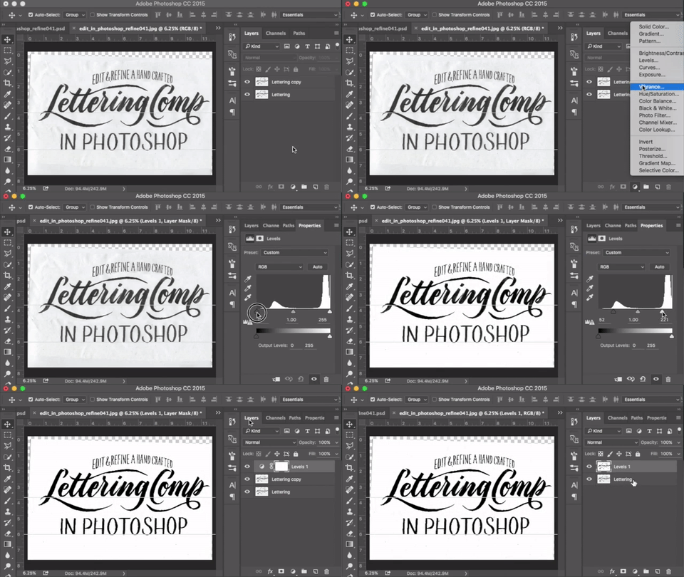
Use a levels adjustment layer to increase the contrast of a copy of your lettering layer.
I start by making a copy of my lettering layer (Hit Command + J on mac), and then add a Levels adjustment layer on top of the copy. By toggling the left and right sliders toward the center of the levels diagram, we tighten up the contrast between the dark lettering and the light background. This will improve the accuracy of the mask we are about to make, in order to cut out the original lettering from the background. Next, select both the levels adjustment layer and the Lettering Copy layer, and merge the two by hitting Command + E on mac.
Use Color Range to make a selection
Now that we have a copy of our lettering that is reduced to solid black letters on a white background, we can use Select > Color Range from the top drop down menu of photoshop to select the black in our copy layer. After hitting OK, you will have created the selection around your lettering that is needed to remove the background. Next, delete your lettering copy layer, select the original layer by clicking on its name, and then mouse over and click on the Add Layer Mask icon at the bottom of the Layers palette. (It looks like a rectangle with a circle cut out of the middle) Now you have successfully separated the lettering from it’s background while retaining the natural texture of the original scan.
Use the Polygon lasso tool to quickly separate each part of your composition
Hit L on your keyboard to access the lasso tool. I prefer the Polygon Lasso tool because you don't need to have a steady hand to create a quick selection. If you hit L and photoshop defaults to regular lasso tool, you can hold shift while hitting L and it should cycle through to the Polygon lasso tool. You can separate each part of your composition onto its own layer by selecting it with the lasso tool, hitting copy, delete, and then paste in place by hitting Command + Shift + V. This will create a new layer for the object you have pasted. Name that layer and then move on to your other sections. In this case, I separated the top, middle, and bottom portions of the composition.
So this is where the fun begins! Now that we have the lettering isolated from its background and each section on its own layer, we can more easily make adjustments.
3. Align letters using geometrically sound guidelines
Since I sketched out the lettering by hand, the phrase “edit and refine a hand crafted” sits on a less than perfect arc. To create a geometrically sound arc for a guideline, we can use an ellipse from the shapes menu.
Use an ellipse path to create guides for positioning your letter on an arc
Start by creating a new Layer and name it Arc Guide. Then select an ellipse from the shapes menu in the toolbar. You can hit shift + U to cycle through the shapes, or you can click and hold for a menu of shapes to pop up. Click on the ellipse, and make sure that it is set to create a path as opposed to a filled shape. Once you drag out the ellipse to whatever shape you are going for, select your path from the paths palette and click on the Stroke Path with brush Icon at the bottom of the Paths Palette. Now, you can add a colored stroke from the FX menu to your path and duplicate this layer to be used as guides for your arc.
Align your letters to the arc guide created from the ellipse path
Now with your arc guides created, you can use the Polygon Lasso tool to quickly select each letter to align it onto the guide. To adjust a letter that is too small, select the letter with the lasso tool, then hit Command + T to access the transform boundary box. From here, you can position the letter on the guide and and adjust the height or width by dragging the top, bottom, left, or rightedge. If you want to skew the letter, you can hold down Command and click on the top, bottom, left, or right corner.
4. Adjust the shape of a letter with the Warp Tool
This is a really powerful tool! In this demonstration, I wanted to elongate the descender of the letter “p”, but I didn’t want to affect the tail that loops off of the descender.
Use Warp Tool to adjust curves
To do this, I selected the right portion of the descender, moved it down until it was positioned where I wanted it, and then used the warp tool to adjust the loop. After selecting the area we want to warp, we can hit Command + T again to open up the transform boundary box. Now, we can hit Control and then click, to prompt the option to select the Warp tool. Working with the Warp tool is really intuitive. You just click and hold on the area you want to move around, and then adjust from there. This tool is great for adjusting curves.
Use the Clone Stamp Tool to patch up broken letters
The Clone Stamp Tool will allow us to compensate for the missing part of the descender between the new and old position. Hit S on the keyboard to bring up the tool. The way it works is, you sample an area by holding down the Option key and clicking, and then you can basically paint with the texture of the area you have sampled. For this example, I sampled the areas above and below the area that needed to be filled. I like to fill the interior of the letter using a soft brush, and a hard brush for the edges.
Adjusting brush size and hardness has never been so easy.
We can easily adjust the brush size and hardness by holding down Control + Option, clicking, and then dragging the mouse up, down, left, and right. Dragging the mouse left and right will adjust the size of the brush, and dragging up and down will adjust the hardness and softness of the brush. When you get a hang of this technique, it really speeds up your workflow!
Well, I hope you guys learned something from this article! And if you are hungry for more knowledge, a fellow lettering artist Dina Rodriguez under her business name Letter Shoppe, has put together a similar but different process for editing your lettering digitally! Her article talks about editing in photoshop, and then vectorizing in illustrator. Definitely check it out. I think it's really important to learn from as many people as you can. Doing so, you will build up a wealth of knowledge to tap into when solving lettering or design problems.


