
Hello, and Happy Friday! I apologize for sending this out late! We have thunderstorms last night, and I lost connection to the internet, so I had to finish up early this morning!
In this weeks newsletter, I'll be teaching the Photoshop and Illustrator tricks as well as the creative process I used to create a mural this last week. I am interested in pushing my design skills to incorporate both illustration and lettering together, and since I decided to create the mural this week, I figured I could share with you a behind the scenes look at the steps that went into creating the mural. So now, I'll walk you through the basic steps I took to create this mural!

1. Decide on a Topic
Before designing anything, the first challenge I had was to decide what I wanted to create. I've been listening to a lot of music lately, so I decided to scroll through Spotify to see if I could find inspiration in any of the songs I've been listening to lately. As I skimmed through the songs, I was looking for a title that could inspire a concept, so when I came across Lose Yourself To Dance by Daft Punk, imagery of dance parties, energy, and motion immediately came to mind.
2. Write list of ideas / Find Reference Images
The next step of my process was to quickly jot down all of the things that came to mind when I thought about dancing. I then looked online to find images of the items from my list to try and find some visual inspiration.

Once I had a couple visual elements, picked out, I jumped right into creating my piece of lettering for the mural.
3. Create the Lettering - Use Guidelines - Download and Print them!
For this mural, I knew that I wanted to use a brush script, so I broke out my hand dandy guidelines sheet and got to work.

If you are working with scripts or Italics often, I recommend printing out some guidelines and then just keeping them around for when ever you need them! If you want some guides to print off, I have some for you to download whether you prefer Letter Size, Tabloid, or Super B.
4. Clean up Sketch in Photoshop, then Bring into Illustrator and Image Trace
I went through my sketching process using a brush pen, and ended by inking the outlines of my letters with a fine tip marker. I then took the sketch into photoshop to bump up the contrast of the lights and darks, so now there is pure white, and pure black.
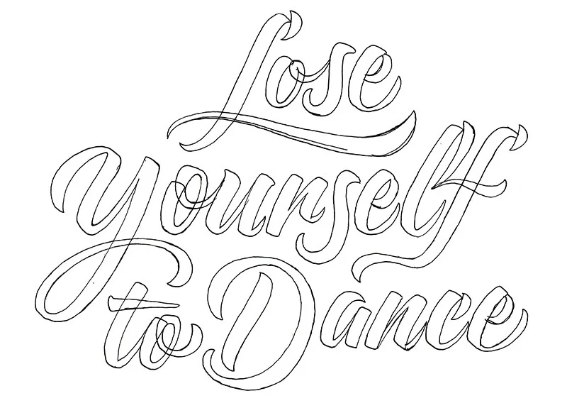

As long as your sketch is high resolution, Image Trace can actually do a pretty good job with quickly vectorizing your lettering. It's not going to give you the perfectly geometric curves that are achievable by using the pen tool and bezier curves, but if you are ok with the natural texture of your hand drawn lines, its one way to do it!

Next, I adjust the Image Trace options. First things first, I hit Preview so I can see what the sliders are doing. I then adjust the threshold, and click the button "Ignore White". The threshold will determine how closely the vector points match your line quality. With a higher threshold, there will be more points, but the line will look more realistic to your drawing. The "Ignore White" will drop all the white from your image, so when you expand the tracing, you will be left with just the black part of your drawing, which means easy isolation.
Once your previewed settings look good, you can hit Expand to create the vectors.

If your sketch is an outline, delete the inner shapes of the stroke to leave behind the filled shapes. Select inside shapes with the Direct Selection tool - A on the Keyboard.
5. Create Elements within Illustrator - Star / Ping
A shape that I have seen popping up in a lot of illustrators artwork is a rounded, 4 pointed star; or a ping.

This shape is really easy to create. All you do is select the star from the shape palette in your toolbar. Then click anywhere on your art board to prompt the Star Attributes Panel. From here, You can adjust the amount of points you want your star to have, and you can also adjust Radius 1 and 2. Once you've got your star shape created, you can select the shape with the Direct Selection tool (A) and then adjust the Corner Radius in the top Tool Bar to create Rounded Corners.
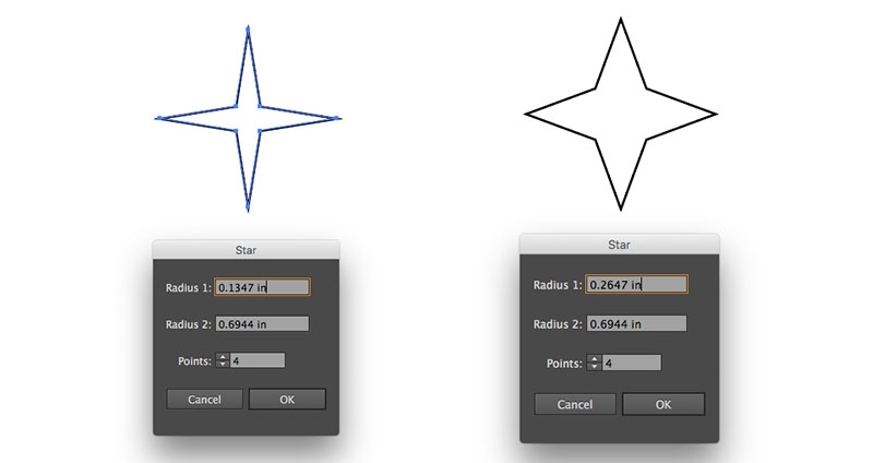
Radius 1 will affect the inner radius of the star. The numbers you set depend on the size of the star you have created, so sometimes it takes some fiddling around to get the numbers right. Unfortunately, there is not a preview bottom for this panel. It's trial and error.
6. Create Elements within Illustrator - Spiral Swirl
When I was making the Spiral Swirl, I wanted to avoid having the lines overlap. To do this, I wound up making a grid of dots with even spaces between each dot. I started by drawing one circle, them hit Option + Shift and dragged the dot over to the right a bit. Then I hit (D) to repeat that duplication until I had a row of dots. I then selected the row and Option + Shift Dragged them up to make a copy, and duplicated the row a few times by hitting (D). Once I had the dot matrix created, I used the scale palette to change the scale of some of the dots to create some variance in line width. If you select a shape and then hit (S) on the keyboard, you will bring up the Scale Palette, and from here you can set the attributes to however large you would like to make your shapes. I wanted the variance in width to be random, so I increased the scale of the dots randomly. Also, Once you have the Scale Palette set to your liking, it remembers the attributes you set. So, you can then adjust multiple items, One at a time, by hitting S, and then clicking enter to approve the Scale Attributes.

After adjusting my Matrix, I used the Twirl Tool to Twirl the matrix into a spiral. To get the Fibonacci Sequence spiral, I set the radius of the Twirl tool to be much larger than the Matrix of dots. I then hovered above the Matrix, positioning the matrix in the top portion of the Twirl Tools Radius.

7. Create Elements within Illustrator - Checker Dance Floor
I wanted to incorporate the checker dance floor, because in my mind, it is iconic. To create the alternating black and white squares, I used the same method that as I used to make the Matrix of dots. This time, I wanted to make sure that the corners of the squares aligned perfectly, so before copying and dragging the squares to make duplicates, I made sure that Align to Grid was turned on. This way, the corners of the square snap together, aligning perfectly on top of each other. Note: I only used black squares, and let the white of the art board serve as the white checker squares, seen in between each of the black squares.

Next, I grouped the squares (Command + G), and then Hit (E) to access the Free Transform and Perspective tool. This tool allows us to quickly adjust the perspective, by skewing the shapes. Once the squares were skewed to my liking, I masked them to the confines of my art board by drawing a large square over the top of the group and hit Command + 7 to make a mask.
8. Put It All Together
