Formal Script Lettering Basics

If you are looking to add elegance and sophistication to your design, you should consider using a formal script. This refined style screams, “I’m fancy and I don’t care who knows it!”. It’s a difficult style to write with calligraphy and to draw with lettering, but I have some tips that will make it easier to wrap your head around.


1. Learn from Good Examples - Examine the Anatomy of the Style
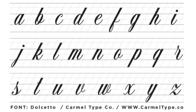
First of all, in my opinion it is imperative to study high quality examples and reference styles, so in this lesson, I will be referencing the fontDolcetto, created by Carmel Type Co. I bought this font a while ago because of its incredibly solid construction and elegance. The founders of Carmel Type Co., Drew Melton and Jason Carne make top notch / high quality fonts! While the capitals have a little flare to them with hairline flourishes, the lowercase is a supreme example of elegance and simplicity. If you're a designer, you need this font.

Below, I have aligned an example of Dolcetto to guidelines to point out the anatomy. You might already be familiar with this stuff, but it is really important to understand, so I'll go over it quickly! 

The Cap Height is where the Capital letters rise up to. The Ascender Height is where the ascending part of the taller letters "b, d,f, h, k, and l" rise up to. The X - Height is where shorter letters like "a, c,e,o, m, n . . . " rise up to. The Connector Height is the height at which the connection between one letter will join into the next letter. The Baseline is basically the path that your letters will sit on, and the Descender Line is where the letters "f, j, and y" will descend to, below the baseline.

NOTE: I have increased the space between the letter just to show you how the connections between each letter come up to the same height. Normally the letter spacing is tight enough that the connections will flow seamlessly into the next letter.


2. Use Guidelines  - The Slope of the letters needs to be consistent

It’s really important to draw your letters on a consistent slope. If the slope changes from letter to letter, the style will lose its elegance, and will start to look wonky. It is equally important to draw straight lines as straight as possible. This is why I have designed the following worksheets to help you practice.

To get you started practicing, I have put together a guideline sheet that you can print off and use in conjunction with the capital and lowercase letter sheets where I have aligned Dolcetto to the guidelines.  You can download and print the practice sheets here:  Captials (JPEG - 931 KB), Lowercase (JPEG - 840 KB), Blank Practice Guidelines (JPEG - 776 KB).


3. Practice Basic Strokes - 
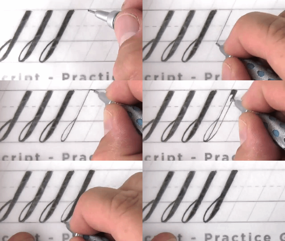
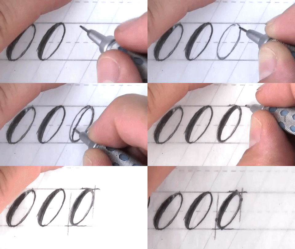
With the exception of the letters “s” and “z”, you can create the entire lowercase alphabet with these 6 basic shapes. 


Below, I will demonstrate how you can draw these basic shapes and what to pay attention to while drawing.

L-stroke 

L-stroke


Inverted-L-stroke 

Inverted-L-stroke


ompound-Stroke 

ompound-Stroke


Loop-stroke 

Loop-stroke


Oval


Oval


Stem 

Stem
 

Combine Basic Shapes to make lowercase letters
Once you have an understanding of the 6 basic strokes, you can start to put them together to draw the rest of the l


Increase the Value You Can Provide as a Designer

Living in the information age, we have access to an incredible wealth of knowledge. One of my favorite resources for learning is Skillshare: an online teaching and learning platform. So, in this weeks newsletter, I want to talk about how using Skillshare can increase the value you provide as a designer.


Skillshare - A Place where Knowledge Flows like Wine and Talented People Flock like the Salmon of Capistrano
Skillshare has attracted some of the most talented professionals to teach online classes, and we as students have an incredible opportunity to soak up as much knowledge as we can. Whether you are interested in Design, Photography, Business, Film, Technology, Fashion, Music, Gaming, Culinary, DIY, Writing, or Crafts, there is a class on Skillshare just waiting for you! Teachers curate and record video lessons for their class project, and then students can enroll and watch the videos at their own pace. Students are encouraged to share their progress in the class project gallery, so other students can see what they are doing and offer helpful feedback. 


Receive Critique from the Skillshare Community - Improve the Quality of your Work
Since your project will be posted to the public Project Gallery, other students can view your progress and leave comments along the way. Constructive criticism from the Skillshare community will act as your second set of eyes, helping you evaluate your project. Since art and design are subjective, it’s nice to have a second set of eyes on your work. 

Community engagement, in my experience, spikes when a class is recently introduced to the platform and a lot of students have signed up and have already started their projects. Since there will be a lot of eyes on the class page, you are more likely to receive feedback. But this is not to say you should refrain from signing up for an older class because you might not receive feedback. Outside of the critique, knowledge shared in the video lessons are invaluable. 


Provide Critique for the Skillshare Community  - Help Others Improve their Skills, While Simultaneously Strengthening Your Own Conceptual Skills
By providing constructive critique to a fellow student, you will be doing two things. First of all, you will be helping another student grow and think about their project in a new light. And secondly, by taking the time to think critically about another students work, you will in effect be flexing and strengthening your own conceptual thinking skills.

Skillshare works best when students are engaged and offer each other advice. As fellow students and artists, we should lift each other up, and offer our honest feedback. To give good feedback, I recommend reading through the student’s entire project before critiquing their work. Students are encouraged to tell a story while sharing their process, so they most likely will have shared their thought process during the creation of their project thus far. Once we understand their perspective, we can offer our thoughts while being cognizant of the reasoning behind their design decisions. 


Knowledge is Power -  Learn Multiple Disciplines and Become Well-Rounded
The way I look at it, the more knowledge and skills we acquire, the more confident we become in our ability to take on any creative project. As a graphic artist, it’s helpful to understand illustration as well as lettering, typography, and photo editing and manipulation. Skillshare has multiple classes on each of these topics, and after watching just a few videos from a class, we can learn techniques that took the teacher years to acquire. In this way, we have a unique opportunity to learn and grow our skills faster than ever.

After taking a few classes, you will notice that every professional has their unique creative process. For instance, lettering artist and typographer Simon Walker spends most of his creative process working digitally, while Martina Flor is a lettering artist who refines her work with pencil and tracing paper, creating rapid iterations until her sketch is as close to final as possible. 

I used Martina’s rapid iteration process to hand letter the word Value. 

I used Martina’s rapid iteration process to hand letter the word Value.
 

If you prefer the method of one teacher over the other, you can tailor your creative process in that direction. The idea here is to take as many classes as you can, so you can figure out which methods work best for you.


Cultivate a Desire to Learn - Never Stop Learning
All it takes is a little self-discipline to sit down and commit to learning, but I promise you, once you realize how much you can get out of online classes, you will start to fuel a desire to learn. Like never before, we have access to the tips, tricks, and techniques of countless professionals who are actively working in their chosen field of study. 


Let me take you under my wing - I am publishing a Skillshare class!

This May, I will be participating in the Skillshare Teaching Challenge in an effort to complete and publish my first online class by the end of the month.! I’ll be teaching Illustrative Lettering and my class will be called Turn Letters Into Art. The project will be to letter and illustrate your favorite letter or your initial. I’ll teach you how to come up with ideas for your project, techniques for lettering and drawing, and digital techniques within photoshop! You don't need to have impeccable drawing skills to create beautiful letters and art, and I hope to share with you some powerful knowledge that will help you create anything you set your mind to. Feel free to follow me on Skillshare, and I’ll make sure to keep you updated on my progress! 


Creative South: Why you need to go next year!

Do you long to be part of something larger than yourself? If you are in the creative field (or even just interested in it), that something is Creative South. It is a design conference held in Columbus, Georgia that brings together some of the most talented people currently working in the design and creative community. Packed with workshops, live events, and talks, the conference spans three days and is just the right amount of time to get to know some great people, and to refuel your inspiration with new ideas.

Last week, I attended Creative South for the first time, and it was hands down the most incredible experience I have had in months. In this week's Newsletter I’ll explain why you need to make it out to Creative South next year. If you attended this year, you know what’s up, but I am still going to share a bit of my experience!


Meet your new family at Creative South
I traveled to this conference by myself, but by the end of it all, I was enjoying breakfast with a big group of my new friends! I recognized most of these guys from online, but getting to meet them in person was just so cool. Meeting new people and sharing the experience of Creative South was transformative on a mental and spiritual level. I left the conference with new techniques for creating art, and a fresh perspective on how other people in the creative field operate their businesses. But most importantly, I met incredible people, and left the conference with the sense of belonging to something larger than myself. Who doesn't love making friends?  Happy times!  From left to right we've got my new friend Jeffy Thomas (Cut Ink Studio), Myself, Daniel Palacios (Highpulp), Scott Biersack (YouBringFire), Adam Gonzalez (Adam Gonzalez Design + Typography), Dan Lee (DanDrawnWords), and last but not least Ian Barnard! What a pleasure it was too meet these dudes! (Photo credit to some dude who took our photo, and Ian Barnard for editing and posting online :) )

One of the mottos of Creative South is, “Come as friends and leave as family.”. On day one, I was greeted at registration by Diane Gibbs, who immediately introduced herself and welcomed me to the conference. It was a fun and comforting vibe from the very beginning! After introducing myself to Diane, every time we crossed paths during the conference, she called me by name, saying, “How’s it going Ray?”. These are the types of genuine interactions you will encounter. 

Everyone is there to have a good time and you will be surprised at how friendly everyone is. 

Creative South defies what you might expect from a conference. At least for me, before attending Creative South, my idea of a conference was not really a place for fun. I first associated a conference with networking for the sake of networking, and I imagined a bunch of people in suits and ties discussing various business matters. But, to paint a picture of how casual and fun this conference was, we drank mimosas during the first workshop I attended at 8am. 

While there was networking going on, almost all of the interactions I had with meeting people felt genuine and natural. 


So Many Opportunities for Learning and Growth
The first day of the conference was devoted to workshops. If you wanted to stay busy all day, you could enroll in up to 4 workshops in a row. They were relatively cheap ($150 each) considering the value each offers! In the past, I have spent almost $500 on a single workshop, so when I saw the prices so cheap, I signed up for three classes right away. Definitely worth the money for the experience and knowledge. 

One of the workshops I enrolled in was a t-shirt design and screen-printing workshop put on by Real Thread. We learned a bit about what what types of t-shirts are awesome, and then there was a t-shirt design competition that I tied for first place in! Since I won, I'll be receiving over 30 t-shirts with my design printed on it! We only had 30 minutes to design, so I decided to hand letter the word Hey!, because it's a short word and it's what I was saying all weekend while meeting new people! I'll have sizes from Small all the way up to XL, so let me know if you want a t-shirt! I'm still figuring out how I will be able to ship them out. If I sell them, I'll make sure that you guys get a great deal, and a personalized letter from myself. I love you all, and I really appreciate your support! Below is my design! Not sure how it will be applied to the t-shirt yet, but once I get the digital renders back, I'll let you know! 

The workshops were fun and valuable, but the Welcoming bridge party afterwards was the bomb! There was free food, drinks, and everyone was there having a good time meeting one another. Seeing in person all of the people you follow online is a surreal experience! Even though you are meeting for the first time, you might already feel like you know that person. It’s a beautiful thing to finally meet your idols in the flesh. And it’s also equally beautiful to connect with other like minded people that you do not already follow online. 

After a couple hours to get your food and drink on, there was a live event called InkWars! 8 artists were given broad nib paint markers, a 4’x8’ canvas, a theme, and an hour to fill the canvas. There was music, energy and suspense about what the artists were going to create. Lots of fun! Here are two of my favorite pieces!  ( I believe this is Andy Hunt on the left and Dylan Menges on the right)

Fifty-two artists fought head to head to design each letter of the alphabet during the live event held all day Friday called TypeFight. I was lucky enough to participate in this event and I was paired up against a really talented lettering artist. If you want to commit to something that will make you grow as an artist, sign yourself up for the Live TypeFight next year! I was hesitant participate because I knew it would be a challenge, but committing to fight in the boxing ring motivated me to focus and practice my lettering more deliberately. That's right! There was actually a boxing ring for us to design in while we had one hour to complete our letter! I think it’s a general rule, that once you commit 100% to something, you will start to take the steps necessary to accomplish whatever is at hand. Here's the letter I designed, I had to design an "F". 

The last two days of the conference were primarily focused on talks. Topics and approaches varied from speaker to speaker, but the main theme of each talk seemed to be of encouragement. There were stories of failure, struggle, and success, and by the end of the two days, if you were paying attention, there was no way you could leave the conference feeling unchanged or uninspired. 


Face Your Fears and Find Strength In Community
Since this was my first time and I wound up traveling alone, I have to admit that I did have some fears about attending the conference. As I deliberated buying my ticket, my anxious mind ran through scenarios of me just freezing up in conversation and embarrassing myself in front of new people. But all of those thoughts were over the top and irrational. I committed and bought my ticket, and turns out it was the best decision I have made in a long time! The truth is that we are all human, and we all get nervous from time to time. But after meeting a few people, my anxiety faded to the background of my mind, and I started to settle into the vibe of the conference. I found strength and confidence in my newly acquired sense of belonging I felt to this community of creative folks. If you are on the fence about attending a conference like this because you are afraid for whatever reason, I ask that you just commit and go for it. Creative South is meant to be fun and inspiring, and you can't go wrong with surrounding yourself with like-minded creative people!


Stop Comparing Your Work To Other Artist's Work

Hello! Lately I have been writing step by step tutorials, so to mix things up, this week I want to share some advice and a short story. I’ll be writing about why you need to stop comparing your work to the work of other artists. 

It’s ok to marvel at the beauty of a well crafted and awe inspiring piece of artwork, but there is a fine line that we need to be aware of between appreciation and envy. I went through a phase of envying successful artists work, and it made my life more stressful that it needed to be. 

One of the most stressful times for me was when I first started working full time as a package designer. It’s a demanding job, and fresh out of college without a specialized degree in package design, I had a lot to learn and a lot of weight on my shoulders. In addition to learning a new vocabulary, I also needed to streamline my skills in the adobe programs and I had to become an idea machine, which I definitely did not consider myself to be. Time spent on the job was an incredible opportunity for learning and growth, but it was also a time of great struggle. 

My lack of experience in package design brought out a strong feeling of inadequacy at the workplace. I remember pinning my questionable design concepts onto the wall next to the other designer’s work. After seeing what everybody else had come up with, I would think, “that’s a great simple idea, I could have come up with that”.  And then there is an ice cold splash of reality that hits when you realize, “...but I didn’t come up with that simple idea”. I guess what I am trying to say is that often times, coming up with a simple and/or effective solution to a problem is something that comes out of experience. When you have experience in any particular field, right out of the gate you will already know what not to do for a new project. And thus, you will be able to bypass more obvious solutions. This is not to say that a junior designer or beginner in any field cannot come up with a fantastic idea, I am just saying that having experience helps. 

I understand that my struggle in acquiring a new skill-set for a job is not unique, but in addition to my struggle at work, I was adding insult to injury by comparing my lettering work (that I had just begun to practice in my freetime) to the work of artists who had been working professionally in the field for years. 

Comparing my beginner lettering work to the work of already successful artists was one of the most anxiety inducing habits I have ever inflicted on myself. Whenever I had a couple minutes to kill at work, I would quickly log onto the Behance Network to scroll through all the newly featured creative projects. At the end of the day when I got home from work, I would continue to prowl through Behance projects “to get inspired” to practice my lettering. But often times, I would get lost for hours just looking at projects, and would never get around to practicing. I would then feel guilty and anxious for not advancing my skill-set in any way. While immersing oneself in a plethora of creative work might seem like something that would inspire, I eventually found it to be a soul crushing and distracting activity. It was at this point that I decided I needed to make a change. 

From this point on, I decided that I would stop comparing my work to the work of other artists, because I found no satisfaction from constantly reminding myself that I wasn’t as good as the other artists I saw online. It’s not fair to compare your beginner skill-set to that of a professional. 


You wouldn’t hold up your child’s preschool drawing next to a Rembrandt or Picasso for a critique, would you? 

Once I had firmly committed to stop comparing my beginner lettering work to other artist’s work, I also committed to practicing and learning more deliberately. And the way I did this was by seeking education from online classes and weekend in-person workshops. We are all so fortunate to live in an age where an abundance of knowledge is accessible to anyone with a computer or other device with internet. One of my favorite online resources for learning is SkillShare.

I have enrolled and taken a bunch of classes and I have learned a great wealth of knowledge and technical skills that I would not have learned otherwise. For only $10/month, you gain access to every class on their website. And you know what’s awesome? The classes are taught by the professional artists whose work I was obsessing over on the Behance Network. So, I had a shift from feeling envious of these artists and their skills, to feeling humbled by how open they are about sharing their knowledge and not-so-secret skills!

There is great satisfaction that comes each step of the way while learning a new craft or skill. When you stop comparing your skill-set to other artists who are further down the road than you, and you start focusing on improving your own skill-set, it will be easier to appreciate other artists work instead of feeling envious of their skills. 


On an ending note, I am by no means saying that you should never compare your work to other artists work. I think it is critical to educate yourself about what is possible in terms of style and technique, but it can be crippling if you over do it and become obsessed with the idea of not being at the same level as another artist. 


Brush Script Lettering: Write, Draw, Digitize.

Hello! I have had a few people ask me about brush script lettering, so in this weeks newsletter, I want to share with you some tips and techniques for creating custom brush script lettering. I have split this newsletter into three sections: Understanding the Brush Script Style, Drawing Brush Script, and Digitizing in Adobe Illustrator using vector with the pen tool.


1. Understanding the Brush Script Style
Before attempting to draw this style, I think it is important to first familiarize yourself with its key attributes. Below are three ideas to help you start thinking about the construction of brush script letters.

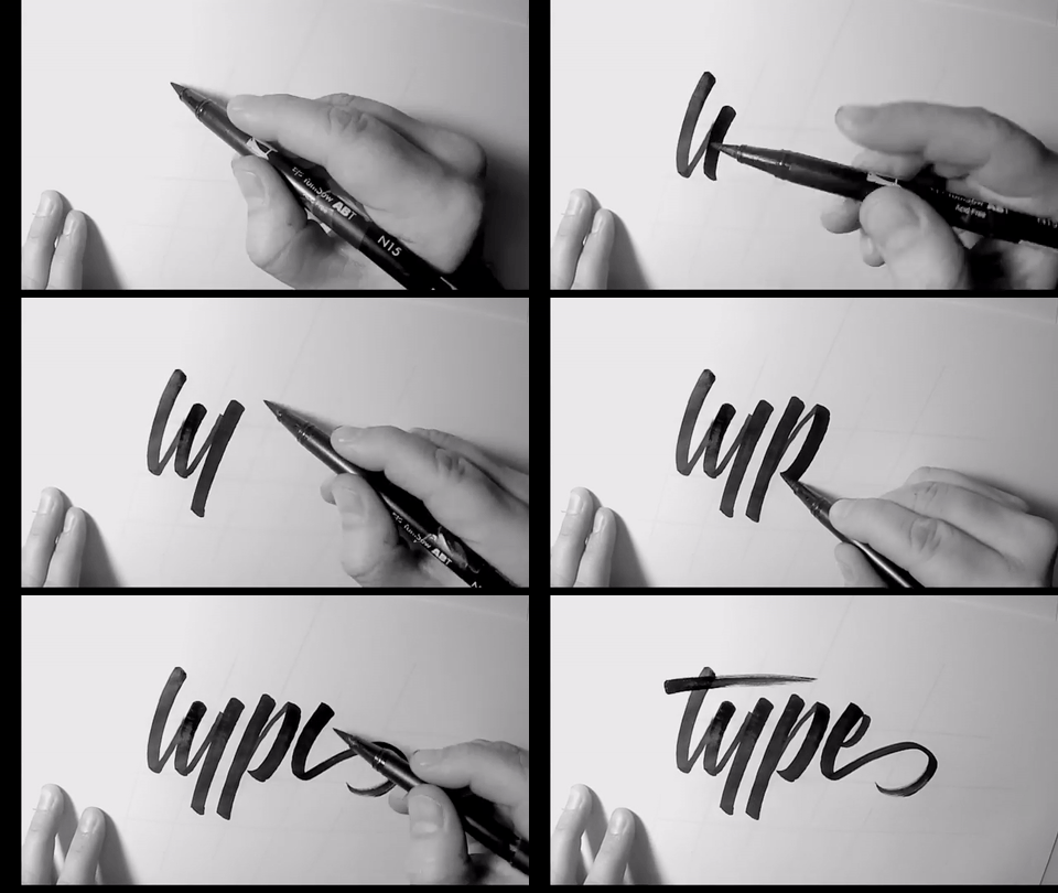
Another aspect of the brush script style is the angle at which the tool is held while writing the letters. This is something that will really help when it comes to drawing the letters with pencil. Notice that the angle of the tool is held consistent…

Another aspect of the brush script style is the angle at which the tool is held while writing the letters. This is something that will really help when it comes to drawing the letters with pencil. Notice that the angle of the tool is held consistently throughout each stroke. In this way, the angle at the top of the stroke should match that of the bottom of the stroke. 

You do not need to write each letter in a continuous manner. You can draw the first stroke, pause, adjust the pressure on the pen, and then precede to draw the second stroke. When writing and drawing brush script, remember that down strokes are heav…

You do not need to write each letter in a continuous manner. You can draw the first stroke, pause, adjust the pressure on the pen, and then precede to draw the second stroke. When writing and drawing brush script, remember that down strokes are heavy because more pressure is used with the pen, and upstrokes are light because less pressure is used.


2. Drawing Brush Lettering
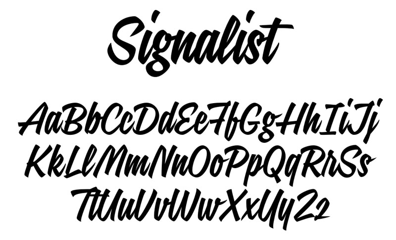
To find a reference to practice from, you can find a few examples by searching “Brush Script Font” in google images. For your convenience, I have pulled the following example. (This font is available for purchase from www.FontBros.com

I’ve got a thing for bold scripts, so for this demonstration I want to focus in on recreating one letter and redrawing it to be even more bold than it already is. I like the capital “R” of this alphabet, so paying attention to the watch-outs we just went through, let’s recreate the letter “R”.

l start by drawing a bounding box for my artwork, and then precede to loosely define the letter. At this stage, I define the angle at the top and bottom of each stroke to be about 45°, and look at the reference with a critical eye and ask questions …

l start by drawing a bounding box for my artwork, and then precede to loosely define the letter. At this stage, I define the angle at the top and bottom of each stroke to be about 45°, and look at the reference with a critical eye and ask questions about the relationships between each stroke of the letter. Notice that the leg of the "R" does not share the same angle as the rest of the strokes. This is because the angle of the brush is adjusted in order to achieve the correct thickness of the diagonal stroke.

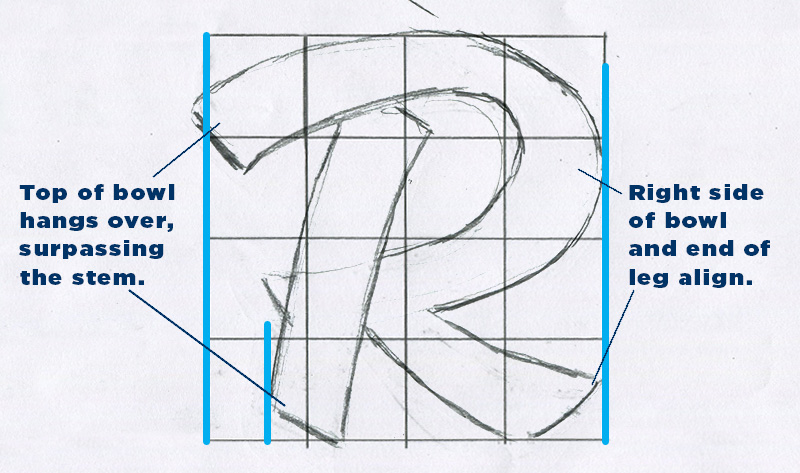
I noticed that in the reference, the top of the bowl extended far to the left; sticking out further than the vertical stem. So, I started drawing that relationship, and then noticed that the right side of the bowl and the leg aligned on the right si…

I noticed that in the reference, the top of the bowl extended far to the left; sticking out further than the vertical stem. So, I started drawing that relationship, and then noticed that the right side of the bowl and the leg aligned on the right side.  
TIP: Draw on top of your grid with sheets of tracing paper so you will have a fresh grid to work with on your next iteration. 

Next, I took a clean sheet of tracing paper, and drew over my loose sketch, adding weight to each stroke to make it more bold.

Next, I took a clean sheet of tracing paper, and drew over my loose sketch, adding weight to each stroke to make it more bold.

Next, I filled in the outlines to get a better understanding of the visual weight the letter has taken on. Then, with another clean sheet of tracing paper, I drew the final outline.

Next, I filled in the outlines to get a better understanding of the visual weight the letter has taken on. Then, with another clean sheet of tracing paper, I drew the final outline.


3. Digitizing in Adobe Illustrator - Vector with the Pen Tool
I start by scanning in the lettering. Since we will be working with vector on top of the image, the scan does not need to be overly high resolution. 

In Adobe Illustrator, I place my image into the document, label its layer “sketch”, and then set that layer to be a template. As a template layer, its contained image will be dimmed to whatever percentage of opacity you choose. Another feature of te…

In Adobe Illustrator, I place my image into the document, label its layer “sketch”, and then set that layer to be a template. As a template layer, its contained image will be dimmed to whatever percentage of opacity you choose. Another feature of template layers is that your image will render even when you are in Outline Mode (Command + Y).  Outline mode is a display setting that will show you the bare bones of your paths. In this mode, the strokes and fills of your paths will be hidden. This mode is useful for studying the shape of your path. I then lock the sketch layer and create a new layer for my digital paths.

Before getting into placing points onto the art, let’s look at a couple examples.

To make circular shapes, points are plotted on the top, bottom, left, and right of the shape, and the handles for each point are evenly distributed. In the example on the right: a similar curve can be achieved by extending the handles of the point o…

To make circular shapes, points are plotted on the top, bottom, left, and right of the shape, and the handles for each point are evenly distributed. In the example on the right: a similar curve can be achieved by extending the handles of the point on the top and bottom, but at the end of the day, the shape turns out looking off balance.

Often times, your letters will not be perfect circles, and in this case, you would distribute the handles a little differently. The points will still be plotted on the top, bottom, left and right, (also referred to as the Extrema), but the handles w…

Often times, your letters will not be perfect circles, and in this case, you would distribute the handles a little differently. The points will still be plotted on the top, bottom, left and right, (also referred to as the Extrema), but the handles will have to be adjusted in accordance to the change in width. As the length of an arc increases, you will need to pull the handles of the corresponding anchor points further. Notice that the left and right handles can stay the same, while the top and bottom handles get longer to compensate for the change in length. Just to reiterate, although the handles are uneven, this is different than the example I showed for the uneven distribution of handles on the circle. In this case, the left and right points still have handles that contribute to the arc.  

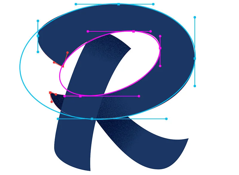
When placing points on an irregular shape, your points should also be positioned on the extrema of each arc. One way to think about the construction of the bowl of the letter "R", is that you are basically creating two shapes; an inside and an outsi…

When placing points on an irregular shape, your points should also be positioned on the extrema of each arc. One way to think about the construction of the bowl of the letter "R", is that you are basically creating two shapes; an inside and an outside. You will need to place your points on the extrema of both the outside and inside shape. 

In the demonstration above, You will see that I like to make adjustments to the path on the fly. In this example, I laid down a point at the far left of the leg, and then moved down to the lowest extrema to plot the next point. At the same time as I clicked to add that bottom point, I held down Shift and dragged to the right until the path between the two points curved to line up with my sketch. I then overshot the pointed corner, adjusted the curve with the direct selection arrow (A), doubled back, and then clicked and dragged to create the final curve path of the leg. I picked up this tip for dealing with pointed corners from the professional lettering artist and blogger Sarah Dayan. She does a great job of explaining the benefits of treating corners in this way, so I recommend you check out her post Vectorizing Hand Lettering: Handling Angles

And here is my final digitized brush script lettered R! I want to write about techniques to style lettering and typography, so I'll save that for another post!