Routines: Become More Efficient By Becoming More Open To Learning


Before I get into this weeks newsletter, I wanted to let you guys know that I am planning on putting together another Design Class with Skillshare, and I am starting to brainstorm some topics. I love to learn and teach, and I could really use your help! If there is any aspect of design or lettering that you are struggling with, I would love to hear from you so I can curate the best content for you! Hit reply to this email now and let me know how I can help! 


"You Can't Teach A Man What He Already Thinks He Knows". This is an axiom that I believe all design and lettering artists should consider. At its core, it addresses our willingness to set all things aside, and to learn. 

It’s easy for us to get caught up in the routine of how we operate, to the point where we do things without thinking. We are on autopilot until something jarring snaps us back into reality. We find one way to achieve any given task, and we clutch onto that method as tried and true. The problem here lies in the fact that, if we are not conscious of what we are doing and why, the activities that constitute our day will eventually become a stagnant and predictable safe zone where our personal growth is stunted. 

“As long as habit and routine dictate the pattern of living, new dimensions of the soul will not emerge.”
- Henry Van Dyke


With that said, I do enjoy and respect certain aspects of routine. By establishing a routine, we develop a pattern of living, and foster a sense of control over certain aspects of our lives. For instance, You might find that you feel your best after taking a morning jog, and so making this part of your routine will consistently bring about positive energy. In this way, we are able to use routine as a tool to better our lives. 


Positive Routines - 
But as creatives, We should be aware of how routine can affect our creative process in both a positive and negative light. Similar to the way one might take a morning jog, lettering and graphic artists can do a few things that set the creative process into motion. A very powerful and fruitful positive routine is reading about your subject matter. If you start a routine of reading, even if it’s just a page or two a day, you will be learning about your subject matter even if you do not take any further action. Just as a jog invigorates the physiology and gets blood flowing, reading about your subject matter will get the neurons in the brain firing in new ways. And then, when the time comes to practice your craft, you will have a reservoir of new ideas and tactics to employ into your work. The key here is to eventually put the ideas to practice. Once you have practiced the ideas, they will become more deeply embedded into your mind. Jogging and reading are two examples of how routine can be helpful to our creative process and in the betterment of the quality of our lives. 


Negative Routines - 
The downside of routine, the other side of the coin, is just as important to acknowledge. Whereas the positive aspects of routine will invigorate our creative process, the negative aspects only suppress it. In order to start making progress in our chosen skill, we need to be mindful that our practice time does not turn into a mindless activity like our morning routine of going to the bathroom and brushing our teeth. This is where the axiom “You can’t teach a man what he already thinks he knows” comes into play. If you go into every practice session without a game plan of what exactly you are trying to accomplish, how can you expect to make any progress? You need to first decide what you want to learn, and then narrow your eyes and tackle it starting from with basic and fundamental principles.

I remember when I was first starting to practice brush script, and instead of learning the basic strokes that the letters are composed of, I would try to imitate examples that I saw online. For the longest time, I didn’t feel like I was progressing as fast as I wanted, and in hindsight I now see that I was going into each practice session with the mentality that I already knew the basics.

To summarize: Whatever it is you are trying to learn, take it slow and start learning basic principles. I know it can sound corny, but you really do need to learn to walk before you run, and this idea applies to anything we are trying to wrap our heads around. 


A Quick Look Into My Lettering Process For "You Can't Teach A Man What He Already Thinks He Knows". 
I started with thumbnail sketches to figure out a loose composition, and then once I figured out a few interesting relationships that the letters could have, I drew a larger skeleton sketch with pencil. I then drew guides on a new piece of paper, and re-sketched in graphite at an even larger scale. Finding the right scale to work can be a bit tricky. You don't want to work too large or too small. Working too small, you won't be able to flesh out the details, and working too large, the drawing can become unmanageable. 

Once I had the large graphite sketch, I scanned it and redrew it in Adobe Photoshop. In Photoshop, I was able to add a little bit of weight to the skeleton, but I left most of that work for the next step. 

Next, I printed my digital refinement and wrote over it using a Pentel Colorbrush to add natural weight to the letters. Then, on a new sheet of paper, I refined the brush pen lettering with graphite to improve weight distribution and overall refinement. 

Lastly, I scanned in the refined pencil sketch, and redrew it digitally within Photoshop with my digital drawing tablet. 


Substitute Alternate Letters - Why and How


Imagine that you just got hired by an advertising agency to create a boat load of lettering pieces. Lets say they want just over twenty pieces of lettering, and they'll need the project completed in the next two weeks. They send over a timeline and you realize in order to complete the project on time, you will need to create multiple final pieces of lettering each day. This scenario is what I experienced for the first time just a couple weeks ago now. While there was a part of me that questioned my ability to complete such a large project in that time frame, I'm glad I took on the opportunity and challenge because it wound up teaching me something that I would like to share with you. When the clock was ticking and I needed to send over a piece of lettering asap, I started to write the lettering with calligraphy fairly quick to get the basic shape of the word, and then made edits by drawing alternate letters and substituting them into the lettering digitally.


Why Substitute letters?
Substituting letters can be a quick and effective way to edit your lettering. For instance: If you started a piece of lettering with calligraphy and executed every letter the way you intended except for one letter that you drew poorly, instead of scrapping the entire piece of lettering, you can scrap just the poorly drawn letter and replace it digitally with a better drawn letter. You will end up saving time because you won't be redrawing letters that already are executed sufficiently. 


Method #1 - Create Multiple Iterations, And Take From The Best
One way to go about a piece of lettering, is by using calligraphy to write out multiple iterations of your word, trying different connections between letters as you move from iteration to iteration. Once you have a solid collection of attempts, you can scan them in to the computer, and make edits within photoshop. For example, if you prefer the letter "s" from your first attempt, and the letter "o" from your second attempt, you can cut out those two letters and collage them into their own new digital iteration. 


Method #2 - Substitute Swash Endings / Flourishes
Once you have the basic shapes for your word, you can substitute in swash endings or flourishes to add flare to the letters. To do this, take a sheet of tracing paper or thin illustration paper, place it on top of your lettering, and try out possible opportunities for embellishments. This way, you can try multiple iterations without ruining your initial lettering. Once you have found the best solution in terms of the addition of visual interest and balancing out the composition, scan the flourishes and add them to your lettering digitally. 


You Don't Need To Be A Master Penman To Utilize Calligraphy - Start Practicing, have patience, and Learn As You Move Forward
I think there might be a bit of a stigma around calligraphy, where its relevancy in todays modern society is overlooked. People might only associate calligraphy with penman transcribing books before the advent of the printing press, but the truth is, there are many new avenues to utilize calligraphy in our modern age. And you don't have to be a master penman to offer calligraphic services. For example, In the project that I described above, I was hired by an advertising agency to create lettering for the custom headlines of their advertisements. Honestly, I had been practicing script lettering for a while, but before the project I wasn't overly confident in the level of my understanding. I guess sometimes it helps to have the pressure of others expectations to push us to perform at our best. I learned a lot during the project because I had to! 

Once your calligraphy is scanned into the computer, you can use photoshop to adjust letter spacing, and you can swap out alternate letters, effectively changing your hand written calligraphy into a collaged piece of lettering composed of your deliberately chosen letters.


Serifs: Tips & A Bit Of History

Hello everyone! Recently, I have been doing a bit of studying to learn more about typography, and for this week’s newsletter, I would like to share with you some tips for constructing serifs. There is an incredible wealth of knowledge on the hi…

Hello everyone! Recently, I have been doing a bit of studying to learn more about typography, and for this week’s newsletter, I would like to share with you some tips for constructing serifs. There is an incredible wealth of knowledge on the history and construction of serif letters as a whole, so my explanation will in no way be exhaustive. Instead of giving a broad overview of all the characteristics of serif letters, I want to focus this article specifically on serifs to demonstrate how they have changed over the years.


Types of Serifs
According to Doyald Young in his book entitled Fonts & Logos, "There are four general kinds of serifs: horizontal, vertical, slanted, and triangular.". A capital Roman letter "E" has three of the four types of serifs, horizontal, vertical, and slanted. 

Below is an example of a triangular serif on the top of the stem of a lowercase "i".


Humanist (AKA Venetian) - 15th Century
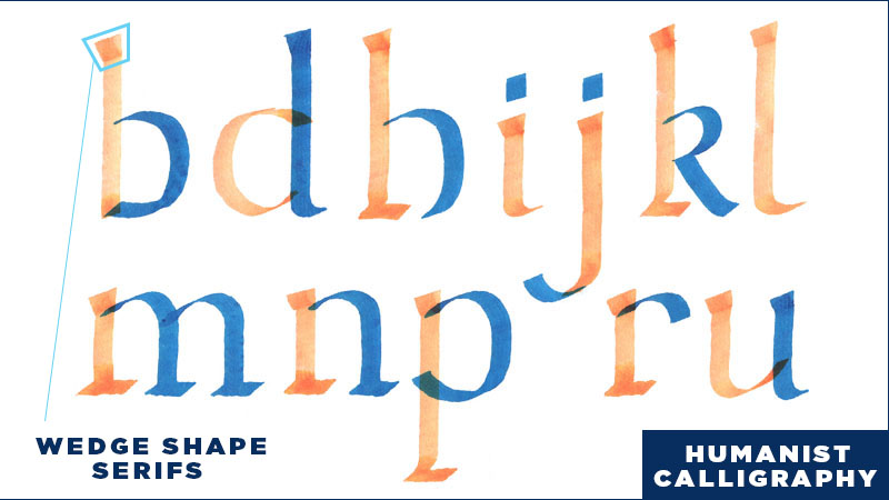
With the advent of the printing press in the mid-15th Century, printable type began to spread outside of Germany where it had originated. In 1470, Nicholas Jenson, a French type designer, moved to Italy where he introduced the art of printing. He created printable type inspired by the humanist style of handwritten calligraphy prevalent in Italy. So, his text typefaces were designed incorporate many calligraphic aesthetics. This style is known for its triangular, or wedge shaped serifs.

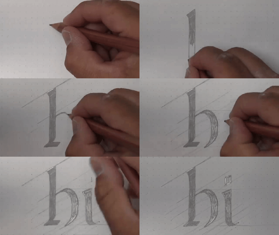
In the calligraphic version of the humanist style, wedge serifs are created by pushing the pen diagonally up and to the left and then up to the right utilizing the thin part of the flat pen. Then a straight vertical line is pulled down from the top of the serif. 

You can begin by using a calligraphic tool and then lettering on top with tracing paper. When lettering in the humanist style, you can round out corners to refine the serifs and to give the letterforms a more friendly character.

If writing calligraphy isn’t your game, I recommend using grid paper while drawing. Lettering on top of grid paper is nice because you can use the units of measurement to more easily make sure the width of your letters is consistent. Unless you are working in a gothic style where letter spacing is consistent, letter spacing will differ depending on whether you have a straight letter next to a curved, or a curved next to another curved. So, lettering a word will inevitably result in letters beginning and ending in the middle of grid units. This is where we can use the units to guide our eye in determining a consistent width for our letters strokes. If you are going for a calligraphic style, you can draw light diagonal lines to help keep the angle consistent.


Old Style (AKA Garaldes)- 16th -17th Century
In his book entitled Fonts & Logos, Doyald Young says that "...font serif designs were similar up to the time of Bodoni's 1818 Tipographia Manuale.". In comparing Adobe Jenson (Humanist, based on text cut in 1470) to Garamond (Old Style, 1540), we can see that the serifs are similar, but definitely a bit different. Adobe Jenson has a wedge serif, which is more similar to Humanist calligraphy. Garamond on the other hand, has refined the wedge into a more acute triangular serif. 


Transitional - 18th Century
Caslon (1725) and Baskerville (1772) are both models of the Transitional style. In this style, the brackets between the serifs and the stem are smaller than in the Old Style, and the serifs are a more refined rectangle. In this period of type history, the letters are starting to become more and more refined and less like replicas of the handwritten letterforms. 


Moderns (AKA Didones) - Late 18th - 19th Century
Modern typefaces are exemplified by Bodoni. In this style, Contrast between thick and thin strokes is extreme, so the serifs are extra thin compared to other styles.  Another thing to note is that the serifs are completely squared off and there are no curved brackets between the serif and stem. The Modern style has taken the leap from the Transitional style, which has some ties back to calligraphy, and has now taken on its own unique style separate from earlier aesthetic ties to humanist calligraphy. 


How I Designed A Mural: Tips & Tricks Within Photoshop and Illustrator

Hello, and Happy Friday! I apologize for sending this out late! We have thunderstorms last night, and I lost connection to the internet, so I had to finish up early this morning! 

In this weeks newsletter, I'll be teaching the Photoshop and Illustrator tricks as well as the creative process I used to create a mural this last week. I am interested in pushing my design skills to incorporate both illustration and lettering together, and since I decided to create the mural this week, I figured I could share with you a behind the scenes look at the steps that went into creating the mural. So now, I'll walk you through the basic steps I took to create this mural! 

lose_yourself_to_dance_Mural.jpg

 1. Decide on a Topic
Before designing anything, the first challenge I had was to decide what I wanted to create. I've been listening to a lot of music lately, so I decided to scroll through Spotify to see if I could find inspiration in any of the songs I've been listening to lately. As I skimmed through the songs, I was looking for a title that could inspire a concept, so when I came across Lose Yourself To Dance by Daft Punk, imagery of dance parties, energy, and motion immediately came to mind. 


2. Write list of ideas / Find Reference Images
The next step of my process was to quickly jot down all of the things that came to mind when I thought about dancing. I then looked online to find images of the items from my list to try and find some visual inspiration.
 

Once I had a couple visual elements, picked out, I jumped right into creating my piece of lettering for the mural. 


3. Create the Lettering - Use Guidelines - Download and Print them! 
For this mural, I knew that I wanted to use a brush script, so I broke out my hand dandy guidelines sheet and got to work.

If you are working with scripts or Italics often, I recommend printing out some guidelines and then just keeping them around for when ever you need them! If you want some guides to print off, I have some for you to download whether you prefer Letter SizeTabloid, or Super B.


4. Clean up Sketch in Photoshop, then Bring into Illustrator and Image Trace
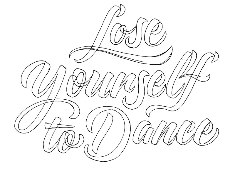
I went through my sketching process using a brush pen, and ended by inking the outlines of my letters with a fine tip marker. I then took the sketch into photoshop to bump up the contrast of the lights and darks, so now there is pure white, and pure black. 

As long as your sketch is high resolution, Image Trace can actually do a pretty good job with quickly vectorizing your lettering. It's not going to give you the perfectly geometric curves that are achievable by using the pen tool and bezier curves, but if you are ok with the natural texture of your hand drawn lines, its one way to do it!

Next, I adjust the Image Trace options. First things first, I hit Preview so I can see what the sliders are doing. I then adjust the threshold, and click the button "Ignore White". The threshold will determine how closely the vector points match your line quality. With a higher threshold, there will be more points, but the line will look more realistic to your drawing. The "Ignore White" will drop all the white from your image, so when you expand the tracing, you will be left with just the black part of your drawing, which means easy isolation.
Once your previewed settings look good, you can hit Expand to create the vectors.

If your sketch is an outline, delete the inner shapes of the stroke to leave behind the filled shapes. Select inside shapes with the Direct Selection tool - A on the Keyboard.


5. Create Elements within Illustrator - Star / Ping
A shape that I have seen popping up in a lot of illustrators artwork is a rounded, 4 pointed star; or a ping. 

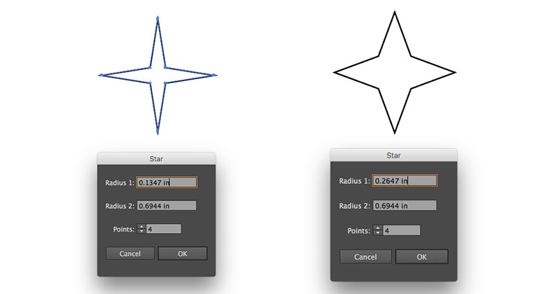
This shape is really easy to create. All you do is select the star from the shape palette in your toolbar. Then click anywhere on your art board to prompt the Star Attributes Panel. From here, You can adjust the amount of points you want your star to have, and you can also adjust Radius 1 and 2. Once you've got your star shape created, you can select the shape with the Direct Selection tool (A) and then adjust the Corner Radius in the top Tool Bar to create Rounded Corners. 

Radius 1 will affect the inner radius of the star. The numbers you set depend on the size of the star you have created, so sometimes it takes some fiddling around to get the numbers right. Unfortunately, there is not a preview bottom for this panel. It's trial and error. 


6. Create Elements within Illustrator - Spiral Swirl
When I was making the Spiral Swirl, I wanted to avoid having the lines overlap. To do this, I wound up making a grid of dots with even spaces between each dot. I started by drawing one circle, them hit Option + Shift and dragged the dot over to the right a bit. Then I hit (D) to repeat that duplication until I had a row of dots. I then selected the row and Option + Shift Dragged them up to make a copy, and duplicated the row a few times by hitting (D). Once I had the dot matrix created, I used the scale palette to change the scale of some of the dots to create some variance in line width. If you select a shape and then hit (S) on the keyboard, you will bring up the Scale Palette, and from here you can set the attributes to however large you would like to make your shapes. I wanted the variance in width to be random, so I increased the scale of the dots randomly. Also, Once you have the Scale Palette set to your liking, it remembers the attributes you set. So, you can then adjust multiple items, One at a time, by hitting S, and then clicking enter to approve the Scale Attributes. 

After adjusting my Matrix, I used the Twirl Tool to Twirl the matrix into a spiral. To get the Fibonacci Sequence spiral, I set the radius of the Twirl tool to be much larger than the Matrix of dots. I then hovered above the Matrix, positioning the matrix in the top portion of the Twirl Tools Radius. 


7. Create Elements within Illustrator - Checker Dance Floor
I wanted to incorporate the checker dance floor, because in my mind, it is iconic. To create the alternating black and white squares, I used the same method that as I used to make the Matrix of dots. This time, I wanted to make sure that the corners of the squares aligned perfectly, so before copying and dragging the squares to make duplicates, I made sure that Align to Grid was turned on. This way, the corners of the square snap together, aligning perfectly on top of each other. Note: I only used black squares, and let the white of the art board serve as the white checker squares, seen in between each of the black squares.

Next, I grouped the squares (Command + G), and then Hit (E) to access the Free Transform and Perspective tool. This tool allows us to quickly adjust the perspective, by skewing the shapes. Once the squares were skewed to my liking, I masked them to the confines of my art board by drawing a large square over the top of the group and hit Command + 7 to make a mask.


8. Put It All Together


Improve Your Lettering with a Pilot Parallel Pen

I have written about How to Use a Calligraphic Tool to Speed Up Your Lettering Process in a previous post, but in the past I used a brush pen to demonstrate. For this week’s newsletter, I want to talk about how you can improve your lettering with a Pilot Parallel Pen.

I made this piece of lettering using a Pilot Parallel Pen to guide the process. There is definitely room for refinement, but this piece is at least starting to shape up. In the following paragraphs, I want to share with you some of the process that went into creating this piece, and I also want to share some of the insights I found as a result from working in this way.


"Practicing calligraphy will equip you with a basic understanding of letter construction, and once you have that, you can start to have more fun with letters."

First and foremost, I want to stress the importance of practicing calligraphy in order to better understand lettering and typography. I'm not here to say that learning calligraphy is the only way to better understand lettering, but in my experience, it really helps. I think a good way to look at it is, practicing calligraphy will equip you with a basic understanding of letter construction, and once you have that, you can start to have more fun with letters.

When I first started learning lettering, I was inspired by the silky smooth curves and attention to detail I saw in the work of professional lettering artists, and I wanted to get better, but I didn’t know how to practice deliberately. If you are just starting to learn about lettering, or if you have been lettering for a while, I recommend studying calligraphy as a way to deliberately push your understanding of letters.

When you first begin, there is a great temptation to try to create something similar to what you are seeing professionals do online. The problem here lies in the fact that the professionals are seen as professional for a reason. They have a solid foundation and understanding of letter construction, and with this, they are able to create letters that have nuance. There is so much to learn, and every piece of lettering presents its own unique challenges. Over the years, I have come to realize that there is a plethora of approaches for creating custom lettering, and using a Pilot Parallel Pen to direct a lettering piece is a process with unique advantages. 


Create More Realistic Letters - Let the tool do the work  
By starting your lettering project with calligraphy, you take a few pieces out of the equation. One thing that happens is, the width of the pen nib ultimately determines the width of your thick and thin strokes. As long as you hold the pen at a consistent angle, the width of your lines will be consistent. This is a really powerful technique, because training your eye to distinguish between very small differences in weight is difficult. Once you have written the letters with the calligraphic tool, you will have a solid foundation of consistent strokes to begin your lettering process. Below I give a demonstration of me trying to draw a gothic letter "a" from memory using a skeleton and applying weight with the pencil, and then I demonstrate how you can write the letter "a" with the Pilot Parallel Pen, and then draw over it. The result shows that we can start our lettering process with letters derived from a calligraphic tool. And in doing so, we are able to draw more classically correct letter-forms.


The Power of Iterations - Embrace the Process
Something that I have to admit is, during the first few stages of a lettering piece, I will often times feel a strong sense of inadequacy. I think this feeling is brought on by high expectations I put on myself and my lettering work. 

"The thing is, every lettering piece is going to start out kind of crumby, and this is ok!"

Great examples of lettering may look as though they were created effortlessly, but the truth is, there were countless revisions and decisions made along the way during its creation that ultimately ended in the final and refined piece. The following animated GIF demonstrates how you can begin with basic letters written in a calligraphic hand, and then refine those letters into a custom piece of lettering. 

In the demonstration above, I started by writing the word "Modern" in a Humanist Calligraphic hand. The first attempt is labeled 1, and this first attempt was improper on a lot of levels. The strokes weren't consistently straight, and the spacing was all off. But on the other hand, even though the spacing and slope were off, I at least was able to begin with consistent stroke widths and correct letter sizes! 

After laying down the basic size and shapes of the letters and word, I was able to use lettering to slowly refine. I started by adjusting letter spacing, and then decided to explore opportunities to add swashes / flourishes.

You will notice that I switch between pencil and pen, and there is a reason for this. For instance, when I wanted to adjust the size of the swash coming off of the letter "M", I first drew the path in graphite. I then used the Pilot Parallel Pen to draw over the path to help me create a more realistic transition from the thick to the thin.

For the second to last iteration, I scanned my lettering, and brought it into photoshop to make some adjustments. After all of my revisions by hand, I still neglected the fact that my letters were not perfectly straight. So, on the computer, I was able to set up guides to manipulate my letters into a correct position.

After all of the digital corrections, I printed off the refined lettering piece, and drew over it one last time. This time, instead of using pencil or my Pilot Parallel Pen, I chose to use a Micron. This way, I could spend some quality time with the lines, to make sure they were drawn as exactly as I wanted them.